Case Study #155
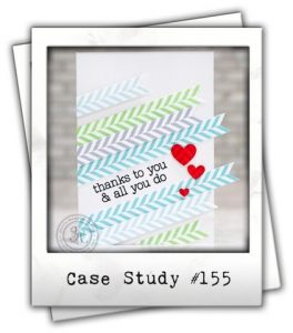
I haven’t played along in a challenge for ages – and what a better way than with Case Study #155 where the Muse is one of my all time favourite card makers – Jennifer McGuire. Here is her inspiration card.

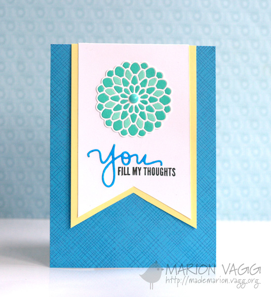
I was drawn to the banners, but created one big one, instead of smaller ones. The background stamping also emulates the diagonal feel that is on Jennifer’s card.

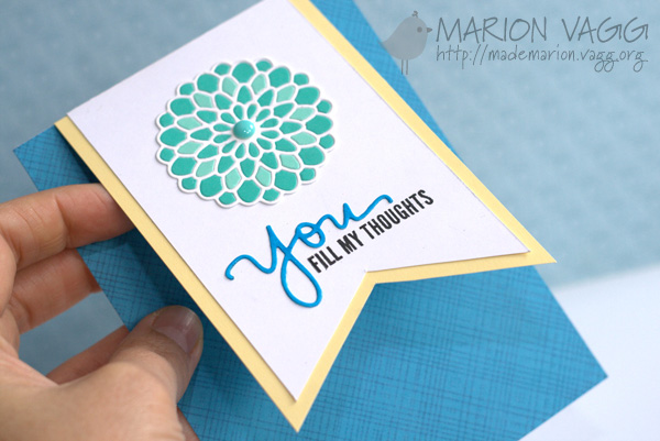
And while I was at it, I decided to try another Jennifer idea and make a card that was not the norm – the banner lifts open to write your message underneath. I can’t find a link to where she showed this idea, but it made such an impression on me I wanted to try it. The main focal point was a little time consuming as I placed all those individual pieces back into the die cut, but I love the result!

Supplies
Ink: VersaFine – Onyx Black
Card: X-Press It Copic Blending Blending Card, Hero Arts Folded Notecards/Layering Papers – Daffodil, Cerulean, Pool and Tide
Other Supplies: Simon Says Stamp ‘You’ die, Simon Says Stamp Delicate Dahlia die, Cuttlebug, Copic Marker B04, MME Enamel Accents
Thanks for stopping by,
![]()


Such a fabulous card!!!
Absolutely stunning! I LUV the focal die cut – you’ve more patience that I have at the moment! 🙂
This is so beautiful and clever Marion! Such a crisp clean design and the colors are perfect together!!!
Love this! I have that die, but it challenges me. Now I’ll have to get it out and try again. 🙂
Terrific card, Marion – love the way the banner lifts. I embedded an intricate die once – note I said “once” – LOL. It is definitely worth the effort though 🙂
I love love love how you pieced that die back together with the different shades of blue. So pretty!
Such a gorgeous card, Marion. The dahlia is stunning! I love the idea of the message under the banner–very clever!
I LOVE how you used the dahlia die!! This is absolutely gorgeous! Thanks for joining us at CASE Study!
Congratulations on win, Marion! Your card is gorgeous… I love that Dahlia die and the way you used the banner.
Congrats on your win over at CASE Study!! Fabulous inspired card~
Wow! Your card is stunning! Love the colors and the design. The layout really shows off the beautiful dahlia. Congrats on winning the CASE Study challenge. Well deserved!
Such a great winner! Love all the ‘Jennifer’ elements you popped in. That die cut flower is just gorgeous! Thanks for joining us at CASE Study 🙂
I adore this one, Marion! The filled in flower just pops and that lift-up banner is genius against the stamped card base!!
P.S. Oops, forgot to say congratulations on the well-deserved win!!